The Psychology of Color in UI Design
Exploring how strategic color choices can influence user behavior, evoke emotions, and enhance the overall user experience of digital products.
Emma Thompson
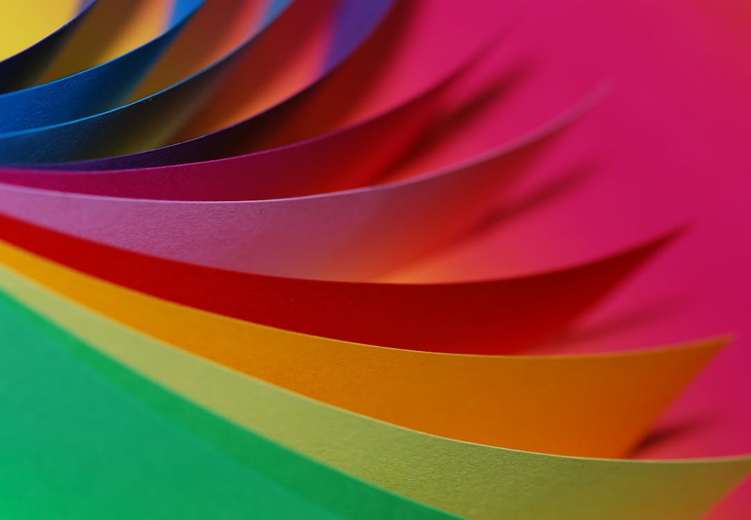
Color is one of the most powerful tools in my design arsenal, yet I find it's often reduced to mere aesthetics or brand guidelines. After conducting a series of A/B tests for the Wavelength music app redesign, I've gathered some fascinating insights about how color psychology directly impacts user behavior.
When we initially launched the app, we used a vibrant purple as our primary action color. The color looked great with our brand palette, but our conversion metrics were underwhelming. On a hunch, I proposed testing different primary colors while keeping all other elements identical.
The results were striking: switching to a specific shade of blue increased our call-to-action conversion by 34%. Even more interesting was how different user segments responded to color variations—younger users engaged more with vibrant tones, while our 35+ demographic showed stronger preference for more subdued colors.
Beyond conversion metrics, I discovered that color significantly affected how users perceived waiting times. By implementing a softer color progression in our loading animations, users reported that the app felt faster, even though the actual loading times remained unchanged.
I've since developed a framework for color decision-making that goes beyond aesthetics:
- Consider the emotional response you want to evoke
- Test color choices with your specific user demographics
- Use color to create visual hierarchies that guide users naturally
- Consider cultural associations of colors for international audiences
- Ensure sufficient contrast for readability and accessibility
The most valuable lesson I've learned is that there are no universal "right" colors—only colors that effectively communicate your message and guide users toward their goals within your specific context.
Next time you're selecting a color palette, think beyond what looks good and consider what your colors are actually saying to your users.
How I Built My Design System from Scratch
A practical guide to creating your own design system, from initial audit to implementation, and the lessons learned along the way.
The Case for Slow Design in a Fast-Paced Digital World
Why designing digital experiences that encourage users to slow down and engage deeply can lead to more meaningful interactions and better outcomes.